Restaurant · Prague 1 · Identity and website
Brand and website for the KOŘEN restaurant
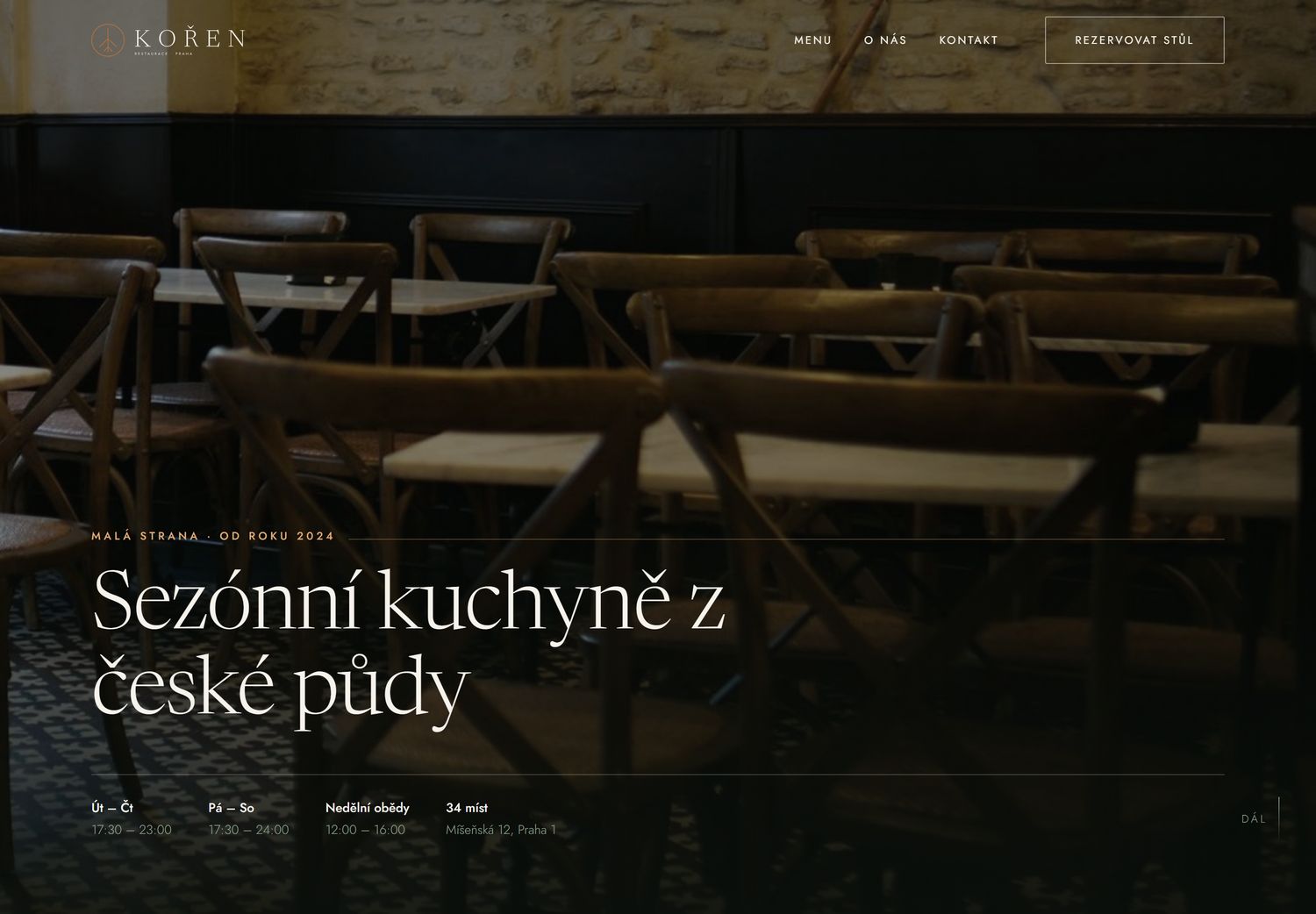
KOŘEN is a restaurant serving modern Czech cuisine in Malá Strana. Thirty four seats, one tasting menu, a carte that changes every three weeks. The website had to be dark and quiet and lead people to a reservation.
- Brief
- Identity, website, copy
- Scope
- 19 page brand manual, 5 page website
- Typefaces
- Newsreader + Jost
- Role
- Design and build
01 / Brief
What had to be solved
Places like this have two opposite problems online. Cheap templates make them look ordinary, and overdone fine dining websites scare off people who just want dinner. The goal was to land between the two: quiet elegance that makes it immediately clear what the place is, and that forces nobody to decode the navigation.
Three words came out of the brief and every later decision was made by them: soil, season, honesty. That is why the brand is earthy and why everything is carried by text rather than decoration.
02 / Brand
Logo, colours and type
The mark is built from one shape, three root lines inside a circle, plus the name set in Newsreader. It works in a single colour, on dark and light backgrounds, and stays legible from 12 mm, so it can be burnt into wood or printed on a receipt.
- Four approved logo variants, no other combinations exist
- Nine colours, the primary one carries areas, copper is only ever a line or a detail
- A contrast matrix of fifty combinations checked against WCAG 2.2
- Fourteen icons in one linear style, 1.5 px stroke
- Charcoal
- Deep green
- Dark green
- Sage
- Copper
- Light copper
- Cream
- Linen
- Stone
03 / Brand manual
Brand manual, nineteen pages
A document you hand to a printer, a photographer or a sign maker and they can tell from it what is allowed and what is not.
04 / Website
Website, five pages
A transparent header over a dark hero, kickers with a hairline rule, the menu set as a typographic list of courses rather than cards with pictures. Reservations are one click away from every page.
05 / Technical notes
What it is made of
- Static HTML, CSS and JS, zero requests to other servers, works offline
- Fonts self hosted as variable woff2, Newsreader 176 kB and Jost 36 kB
- Responsive from 320 px, full screen mobile menu, closes with Esc
- Skip link, visible focus,
aria-current, honoursprefers-reduced-motion - Structured data using schema.org
Restaurantincluding opening hours - Link integrity verified by script: 278 internal links, none broken
Images
The handover includes a list of the photographs that are needed, with the dimensions, a description of the shot and the reason it is there. Until they arrive the design carries honest placeholders with the dimensions on them rather than stock pictures, so the client can see straight away what has to be shot.
Next project
MODŘÍN, boutique hotel & spaWould you like something similar?
Write me a few lines. I answer within two working days and suggest a scope and a price.